How to Use Website Heatmaps: A Practical Guide
Websites have a lot of moving parts. There are content management systems, server configurations, software updates, and more. If a part of your site isn’t func
Website heatmaps are one of the most effective ways to understand how visitors interact with your site. They reveal what people click, what they ignore, how far they scroll, and where they get stuck. If you’ve ever wondered why users aren’t converting, why certain pages underperform, or why your calls‑to‑action aren’t getting attention, heatmaps provide the behavioural insight you need.
This guide explains what website heatmaps are, how they work, the different types available, and how to use them to improve your website’s performance.
Article Sections
- What Is a Website Heatmap?
- Why Heatmaps Matter for Business
- Types of Website Heatmaps and When to Use Them
- How Heatmaps Work
- Choosing the Right Heatmap Tool
- Setting Up Your First Heatmap
- How to Read and Interpret Heatmaps
- Practical Use-Cases for Heatmaps
- Combining Heatmaps With Other Tools
- Common Mistakes to Avoid
- Simple Workflow for Ongoing Heatmap Use
- When to DIY and When to Get Help
- Conclusion
What Is a Website Heatmap?
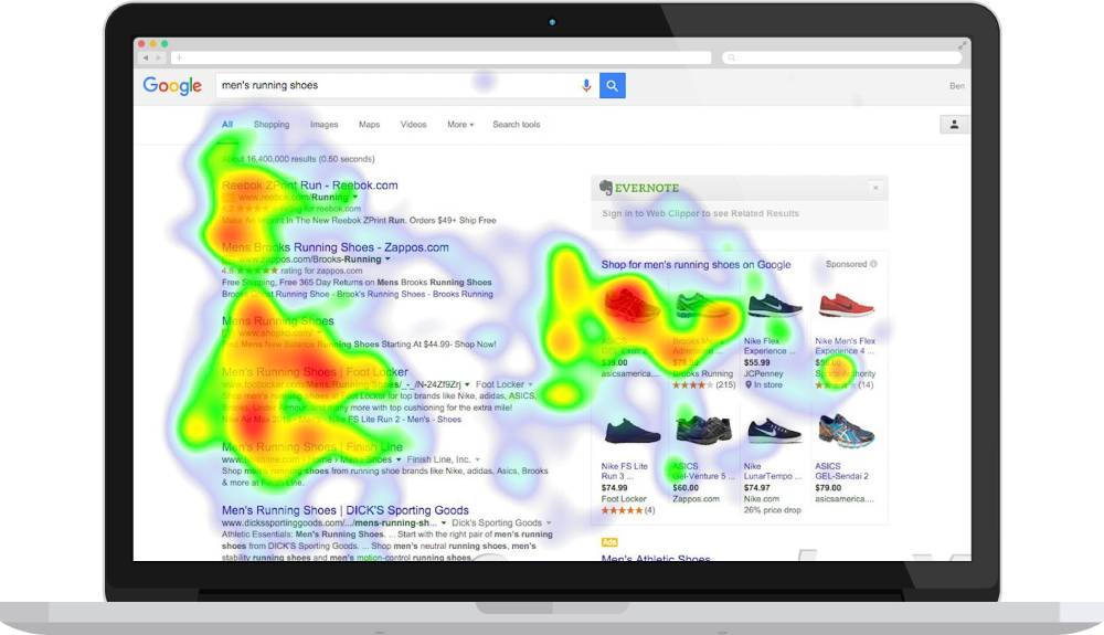
A website heatmap is a visual overlay that highlights user behaviour on a webpage. Areas with high engagement appear “hot” (often red or orange), while low‑engagement areas appear “cold” (blue or grey). Heatmaps translate raw analytics into visual patterns, making it easier to understand how people actually use your site.
Heatmaps help you see:
- Which elements attract attention
- Which areas are ignored
- How far visitors scroll
- Where frustration occurs
- How users behave differently on mobile and desktop
They turn invisible behaviour into visible insight.
Why Heatmaps Matter for Business
Heatmaps provide clarity that traditional analytics cannot. They help you:
- Identify friction in your layout or navigation
- Improve conversion rates by fixing ignored or misplaced CTAs
- Understand user intent and content engagement
- Make design decisions based on real behaviour
- Validate changes before rolling them out site‑wide
For service businesses, e‑commerce stores, and content‑driven sites, heatmaps are a practical way to diagnose issues and improve performance without guesswork.
Types of Website Heatmaps and When to Use Them
Click or Tap Maps
Show where users click or tap. Useful for identifying mis-clicks, ignored buttons, confusing navigation, and unexpected interaction patterns.
Scroll Maps
Reveal how far users scroll down a page. Ideal for understanding whether key content is placed too low, where attention drops off, and how users behave on long pages.
Move or Hover Maps
Track mouse movement on desktop. Helpful for assessing visual hierarchy, navigation clarity, and areas where users hesitate or explore.
Rage Click or Error Click Maps
Highlight repeated clicks on elements that don’t respond. These maps expose broken links, confusing UI components, and form issues.
Zone-Based or Engagement Heatmaps
Group page sections into zones and measure interaction levels. Effective for complex layouts such as homepages, dashboards, or long landing pages.
How Heatmaps Work
Heatmaps use a tracking script to record user interactions such as clicks, scrolls, and movement. The data is aggregated and anonymised, then displayed visually on top of your webpage.
Most tools allow segmentation by:
- Device type
- Traffic source
- Campaign
- Time period
This segmentation is essential for accurate interpretation, especially when mobile and desktop behaviour differ significantly.
Choosing the Right Heatmap Tool
There are many heatmap tools available, each with different strengths. When choosing one, consider the following features:
- Automatic data capture
- Device and traffic segmentation
- Rage or error click detection
- Session replay integration
- Funnel or journey analysis
A few commonly used tools include Hotjar, Crazy Egg, Mouseflow, Contentsquare, and UXCam. Some are better suited for small businesses, while others are designed for enterprise-level UX analysis.
Setting Up Your First Heatmap
A simple setup process looks like this:
- Select a page that directly affects your business goals, such as your homepage, pricing page, or contact page.
- Install the tracking code or connect the tool through your tag manager.
- Choose the heatmap type you want to run.
- Allow the heatmap to collect data for one to two weeks, depending on your traffic.
- Review results separately for mobile and desktop.
This ensures you gather enough data to make reliable decisions.
How to Read and Interpret Heatmaps
Heatmaps are only useful if you know what to look for. Key patterns include:
- High‑activity zones that confirm strong engagement
- Low‑activity zones that indicate poor placement or relevance
- Clicks on non-clickable elements that signal confusion
- Scroll drop-offs that reveal content hierarchy issues
- Rage clicks that point to broken or frustrating elements
Healthy patterns include strong focus on your primary call‑to‑action and consistent scroll depth through important content. Unhealthy patterns include users clicking decorative images, ignoring key buttons, or abandoning the page before reaching essential information.
Practical Use-Cases for Heatmaps
Heatmaps can help solve a wide range of real-world problems.
E‑commerce
- Improve product page layouts
- Fix ignored “Add to Cart” buttons
- Optimise mobile thumb zones
Service Businesses
- Reorder homepage sections based on engagement
- Move contact information higher
- Simplify navigation menus
Landing Pages
- Test CTA placement
- Reduce form friction
- Add trust signals above the fold
Each use-case follows the same pattern: identify the issue, interpret the behaviour, make a targeted change, and retest.
Combining Heatmaps With Other Tools
Heatmaps become even more powerful when paired with:
- Funnel analysis to identify drop-off points
- Session replay to understand behaviour in context
- A/B testing to validate improvements
- GA4 event tracking to connect behaviour with conversions
This combination provides a complete picture of what users do, why they do it, and how it affects your business.
Common Mistakes to Avoid
- Drawing conclusions from too little data
- Ignoring mobile behaviour
- Overreacting to a single heatmap
- Treating heatmaps as a one-time audit
- Making changes without testing
Heatmaps should be part of an ongoing optimisation process, not a one-off task.
Simple Workflow for Ongoing Heatmap Use
- Choose a goal-based page.
- Run heatmaps for one to two weeks.
- Identify two or three clear issues.
- Make small, targeted changes.
- Re-run heatmaps to measure improvement.
- Apply successful changes to other pages.
This creates a continuous improvement cycle that compounds over time.
When to DIY and When to Get Help
DIY heatmap analysis works well for small sites, early-stage businesses, and quick tests. Professional help is valuable when redesigning key pages, interpreting complex behaviour, or building a long-term optimisation strategy.
At Premier Web, heatmaps are a core part of our redesign and optimisation process. They help us make informed decisions that improve user experience and increase conversions.
Conclusion
Website heatmaps turn guesswork into clarity. They show you what users actually do, not what you assume they do. By understanding these patterns and making informed adjustments, you can improve engagement, reduce friction, and increase conversions.
Start with one page, gather data, make a change, and measure the results. Over time, this simple process can transform your website’s performance.